 Install in Dash
 Color Branding Reference
Color Branding
Customize the colors by defining the branding token colors used throughout the interface.
To customize colors, create an SCAppearanceConfiguration instance, specify values for each token you want to change, and store the instance in the SCServiceCloud.appearanceConfiguration property. To learn more about SDK customizations, see SDK Customizations in the Developer Guide.
In Swift:
// Create appearance configuration instance
let appearance = SCAppearanceConfiguration()

// Customize color tokens
appearance.setColor(COLOR_VALUE, forName: TOKEN_NAME)

// Add other customizations here...

// Save configuration instance
ServiceCloud.shared().appearanceConfiguration = appearance
In Objective-C:
// Create appearance configuration instance
SCAppearanceConfiguration *appearance = [SCAppearanceConfiguration new];

// Customize color tokens
[appearance setColor:COLOR_VALUE forName:TOKEN_NAME];

// Add other customizations here...

// Save configuration instance
[SCServiceCloud sharedInstance].appearanceConfiguration = appearance;
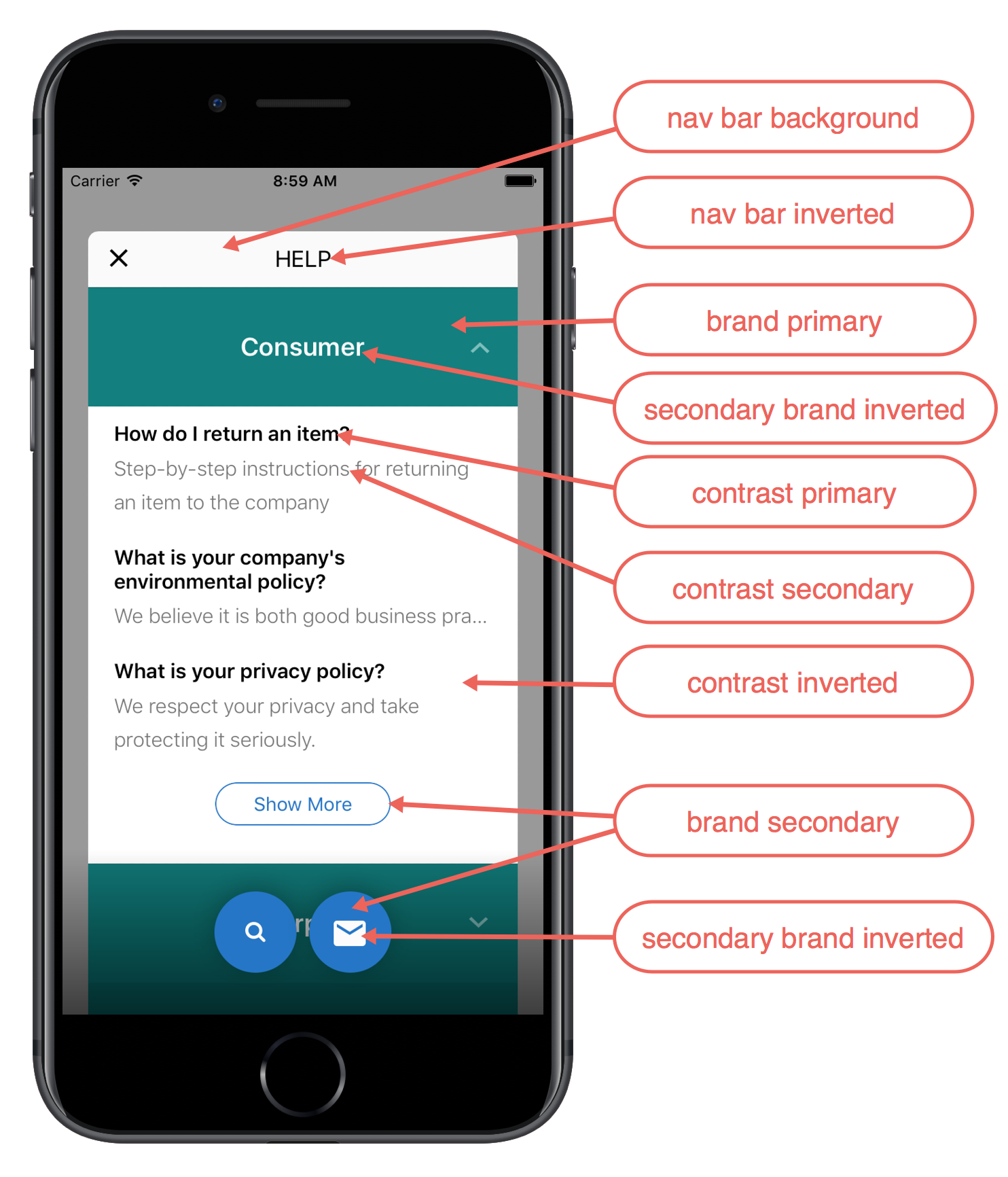
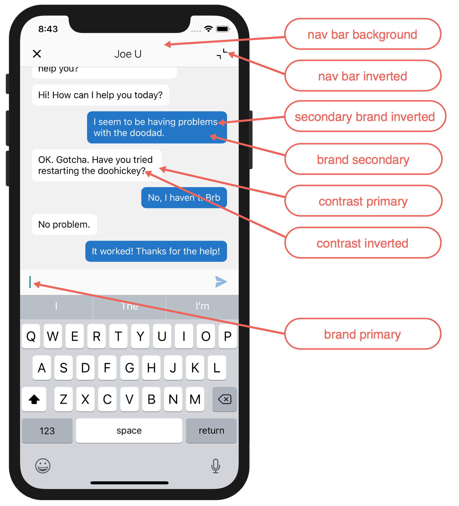
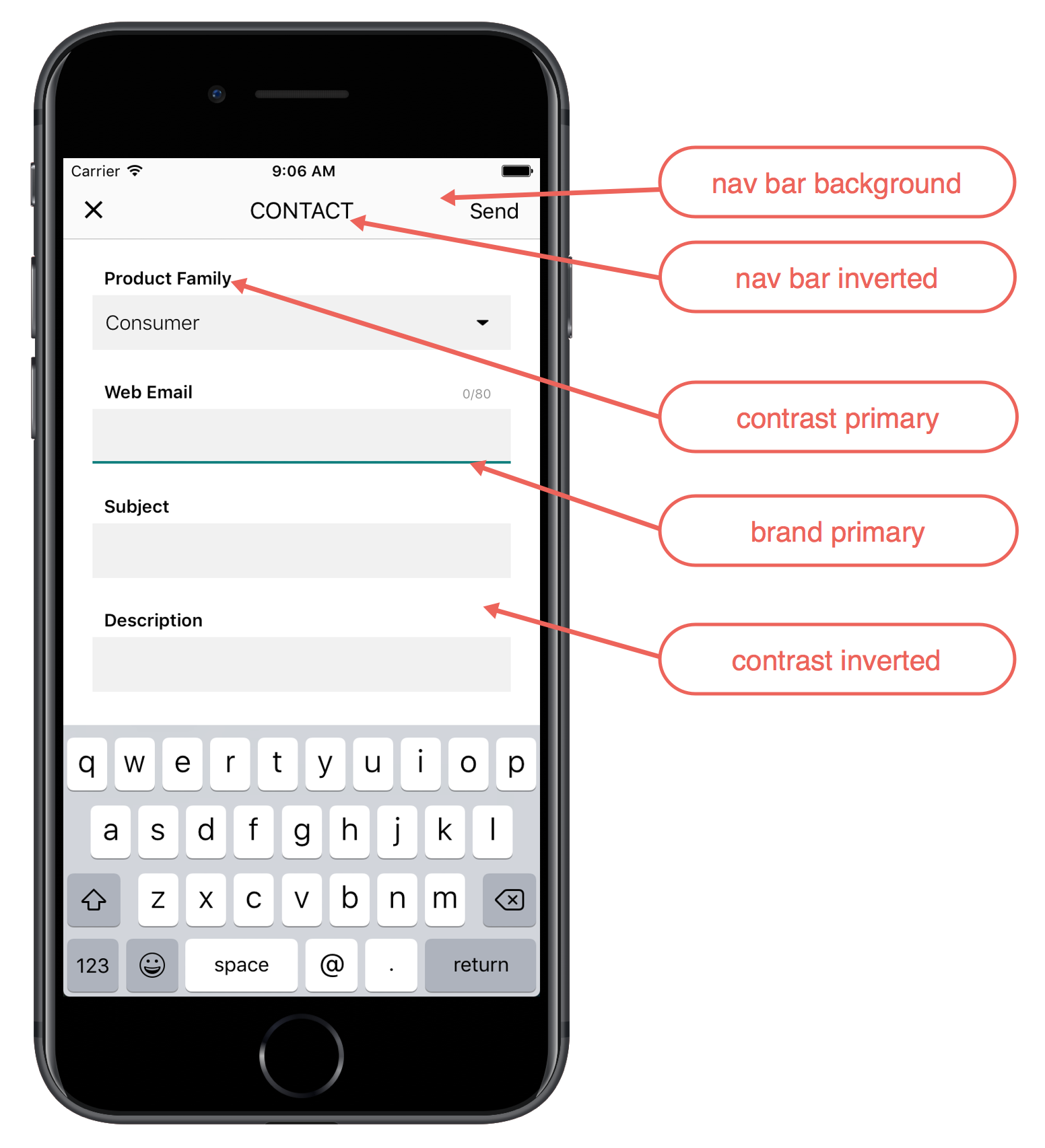
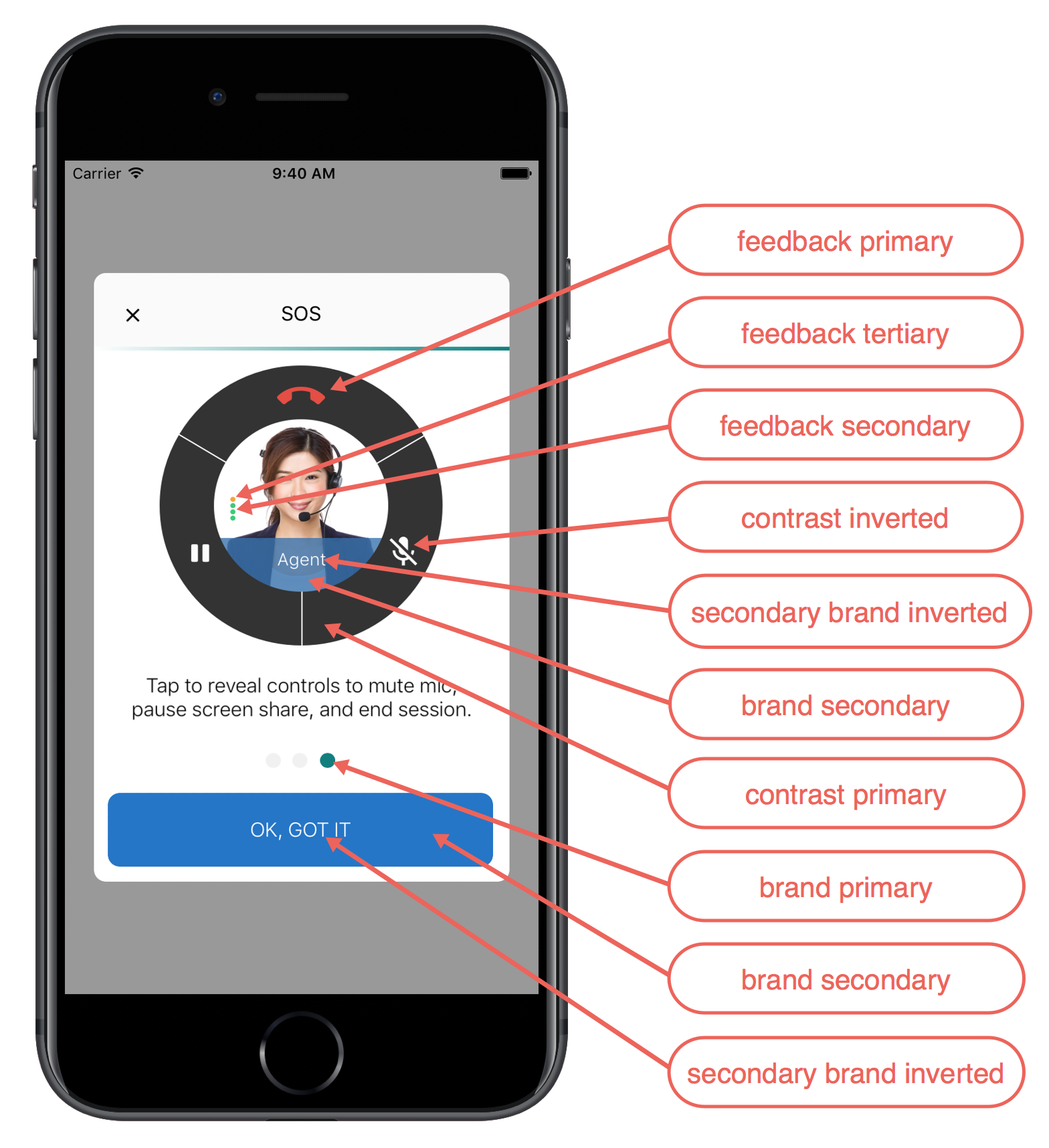
The following branding tokens are available for customization (Swift token/Objective-C token):
navbarBackground/SCSAppearanceColorTokenNavbarBackground– Background color for the navigation bar.navbarInverted/SCSAppearanceColorTokenNavbarInverted– Navigation bar text and icon color.brandPrimary/SCSAppearanceColorTokenBrandPrimary– Knowledge: First data category, the Show More button, the footer stripe, the selected article. SOS: Used for various icons.brandSecondary/SCSAppearanceColorTokenBrandSecondary– Used throughout the UI for button colors. Chat: Agent text bubbles. SOS: Background color for action items.brandPrimaryInverted/SCSAppearanceColorTokenBrandPrimaryInverted– Knowledge: Text on data category headers and the chevron on the Knowledge home page.brandSecondaryInverted/SCSAppearanceColorTokenBrandSecondaryInverted– Text on areas where a brand color is used for the background.contrastPrimary/SCSAppearanceColorTokenContrastPrimary– Primary body text color. SOS: Background color for buttons on the UI.contrastSecondary/SCSAppearanceColorTokenContrastSecondary– Knowledge: Subcategory headers.contrastTertiary/SCSAppearanceColorTokenContrastTertiary– Knowledge: Search background color. SOS: Dots in UI.contrastQuaternary/SCSAppearanceColorTokenContrastQuaternary– Knowledge: Icon image background color. Case Management: Link color. Chat: Background color.contrastInverted/SCSAppearanceColorTokenContrastInverted– Page background, navigation bar, table cell background. SOS: Color of the icons.feedbackPrimary/SCSAppearanceColorTokenFeedbackPrimary– Text color for error messages. SOS: Mute indicator; disconnect icon.feedbackSecondary/SCSAppearanceColorTokenFeedbackSecondary– SOS: Connection quality indicators; background color for the Resume button when the two-way camera is active.feedbackTertiary/SCSAppearanceColorTokenFeedbackTertiary– SOS: Connection quality indicators.overlay/SCSAppearanceColorTokenOverlay– Knowledge: Background for the Knowledge home screen.
The screenshots below illustrate how the branding tokens affect the UI.
Example
The following code sample changes three of the branding tokens.
In Swift:
// Create appearance configuration instance
let appearance = SCAppearanceConfiguration()

// Customize color tokens
appearance.setColor(
       UIColor(red: 80/255, green: 227/255, blue: 194/255, alpha: 1.0),
       forName: .brandPrimary)
appearance.setColor(
       UIColor(red: 74/255, green: 144/255, blue: 226/255, alpha: 1.0),
       forName: .brandSecondary)
appearance.setColor(
       UIColor(red: 252/255, green: 252/255, blue: 252/255, alpha: 1.0),
       forName: .brandSecondaryInverted)

// Save configuration instance
ServiceCloud.shared().appearanceConfiguration = appearance
In Objective-C:
// Create appearance configuration instance
SCAppearanceConfiguration *appearance = [SCAppearanceConfiguration new];

// Customize color tokens
[appearance setColor:[UIColor colorWithRed: 80/255
                                     green: 227/255
                                      blue: 194/255
                                     alpha: 1.0]
             forName:SCSAppearanceColorTokenBrandPrimary];
[appearance setColor:[UIColor colorWithRed: 74/255
                                     green: 144/255
                                      blue: 226/255
                                     alpha: 1.0]
             forName:SCSAppearanceColorTokenBrandSecondary];
[appearance setColor:[UIColor colorWithRed: 252/255
                                     green: 252/255
                                      blue: 252/255
                                     alpha: 1.0]
             forName:SCSAppearanceColorTokenBrandSecondaryInverted];

// Save configuration instance
[SCServiceCloud sharedInstance].appearanceConfiguration = appearance;